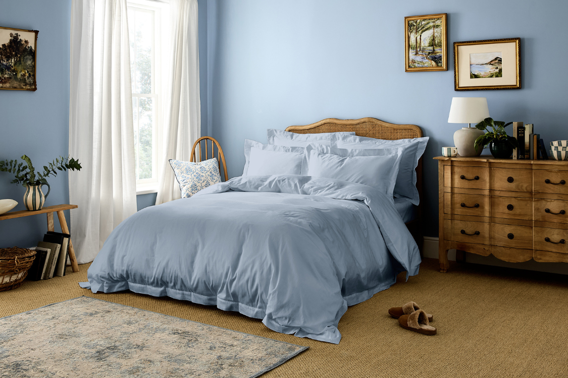
complete bedroom colour guide: blue
Unlike other colours, blue never goes out of fashion. Its balance and tranquillity are the keys to creating a sense of harmony in your home that keeps you feeling energised, but also grounded.
Like all the best colour combinations, this one is taken straight from nature and has been incorporated into interior schemes for centuries—wrapping interiors in a gentle, nature-inspired glow.
why blue works so well in interior schemes
From the sky to bodies of water, Blue’s role in the natural world explains a lot about its unrelenting appeal. In fact, a YouGov survey conducted across four continents revealed that blue was consistently picked as a favourite colour.
It’s particularly useful for bedroom schemes, whether you’re enveloping the whole room or using it is an accent colour. Why? It’s ability to neutralise melatonin levels means it helps you sleep, whilst also energising you in the morning (we think it’s an incredibly happy colour to wake up to!).
Blue can be a cold colour, but when used in the right way, or if you choose a blue with warm undertones, it can feel completely the opposite. It actually has the ability to instantly warm up a room, creating a space that strikes the perfect balance between fresh, cosy and timeless.
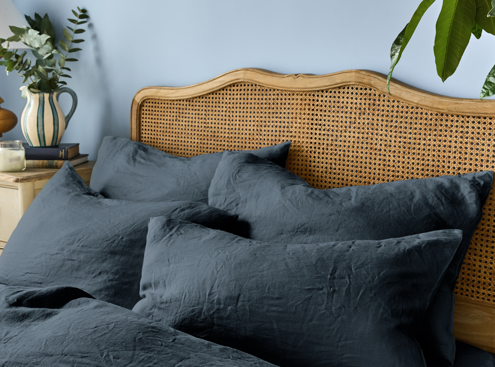
Meanwhile, the darkest blues can add a certain deep richness to a room, along with a surprising amount of warmth, too.
how to style blue
Can you think of any shade of blue that isn’t beautiful? It’s the ultimate versatile colour, with so many combined styling possibilities.
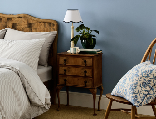
whispers of blue with white
A match made in heaven and such a classic pairing. The design world equivalent of milk and cookies!
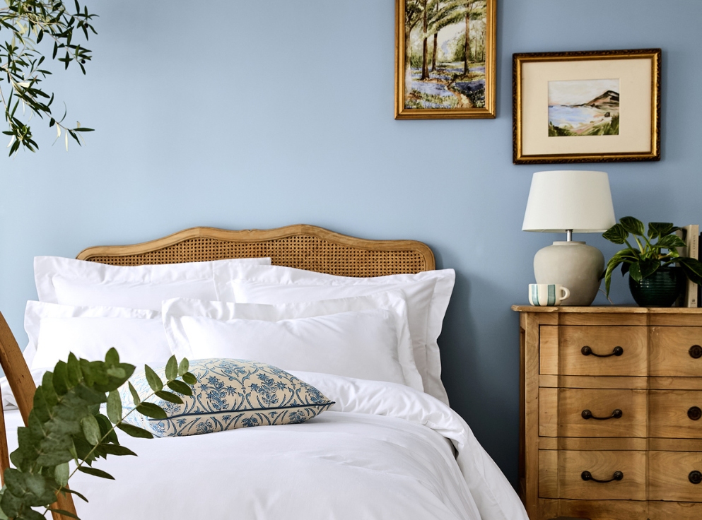
Since the pairing of blue and white naturally brings to mind images of the sea’s gentle waves and cloud-sprinkled skies, it’s a combination that is frequently used in coastal houses to great effect. But it doesn’t have to stop there, and such schemes don’t have to involve super high contrast between the two colours. Simply use warm whites with your chosen blues for a more calming, soothing scheme that still uplifts the senses. You can also pair with natural textures like linen, rattan and unfinished wood for a relaxed yet refined aesthetic.
blue with contrasting colours
For lovers of colour mixing, blue is an excellent choice for pairing with brighter contrasting colours. There is a shade of blue to answer every decorating conundrum…
What do you pair with chocolate brown? Blue!
Green and blue, together? The perfect marriage.
We particularly love nothing more than blue paired with a berry red or burgundy.
Coral and brick accents also work just wonderfully as complementary colours to pair with blue.
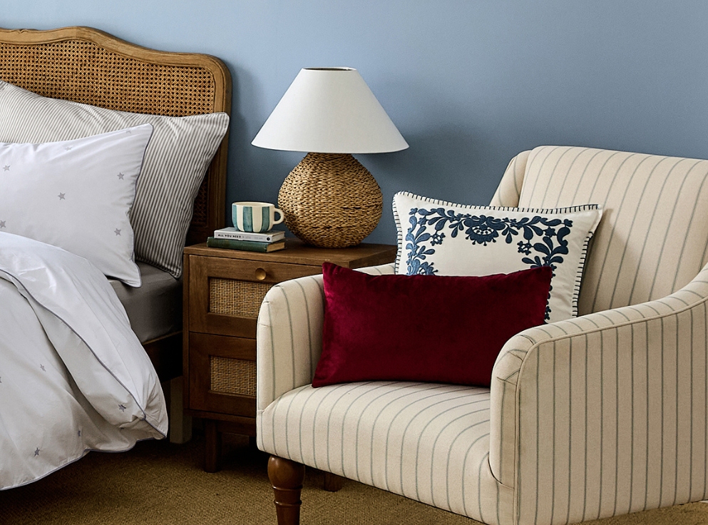
small, unexpected blue bursts
Unexpected pops of blue also work brilliantly amidst different non-matching colour bases. Disruptive yet complementary, it can surprise the eye and help create a more coveted, ‘lived-in’ look that tells a story of having developed over time, without being too uniform.
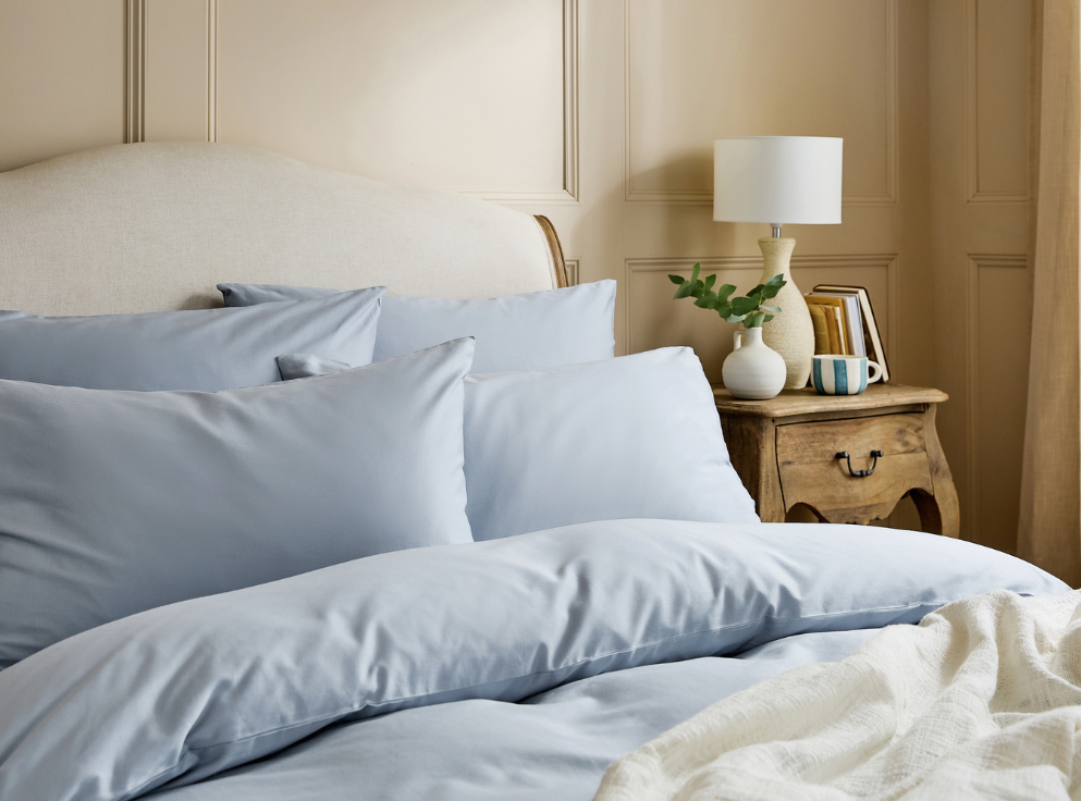
Suit the mood you’re trying to create with our Nordic Sky blue or Fjord blue bedding.
For items used day after day, how they’re made matters. Drift off in bedding made with low-impact dyes that bring charming colours into your home, not harmful chemicals.