complete bedroom colour guide: white
Fresh and ethereal, white is synonymous with serenity and calm. As we live in an often chaotic world, coming home to a clean palette can certainly soothe the soul.
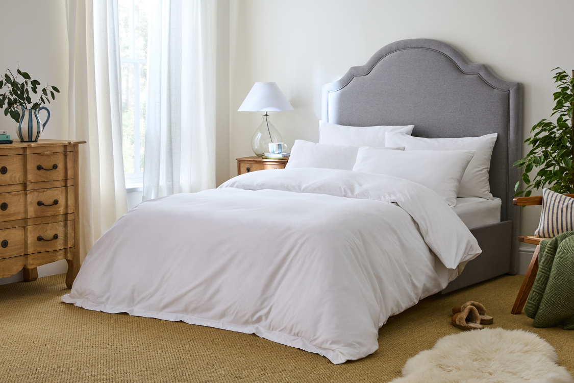
beyond the blank canvas
White is a timelessly comforting colour that has always been (and will always be) used in interior decorating. However, to avoid it feeling uninspired, it’s the way in which you style it that is the key. It can be the perfect clean foundation to building personality through rich textures and additional colours. So, how is this done?
how to style white
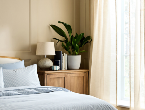
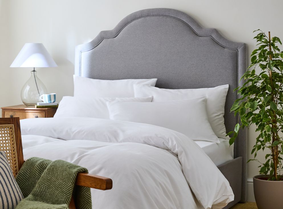
White offers so many stylish possibilities for achieving your desired bedroom feel. The key is to build on, around and into it to create a balanced aesthetic that doesn’t feel flat or bland.
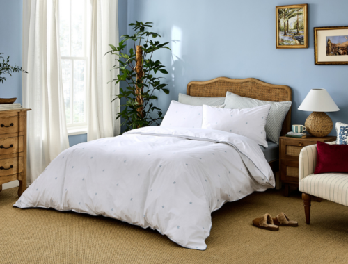
For instance, why not introduce richer hues and considered textiles on top of your primary whites? This can add wonderful interest, and explains why we’re seeing much less white on white, and more of a draw towards deep warm woods, woven wicker pieces, and muted patterns.
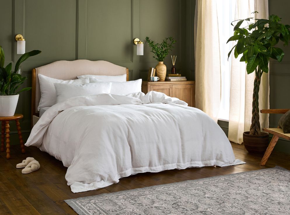
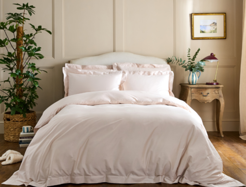
where white meets warmth
Let’s start by setting the scene for inviting warm tones in. Think all-white walls (where warm, inspiring artwork can hang), crisp white bedding (adorned with brown cushions or throws), sheer white curtains (for the summer yellows to filter through)… When combined with such meaningful elements, white has the capacity to really come alive. Cue a tall antique mirror, a textured white wall that uses micro-cement or clay plaster. What we’re saying is, white doesn’t need to mean lifeless or stark.
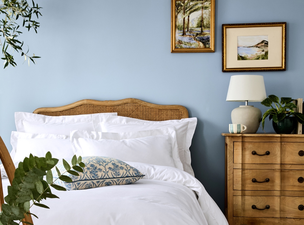
Not to forget the effects of different white paints! One of the best ways to prevent white from making your bedroom scheme too bright, is to use it as a base shade or a quieter highlight.
Whether white is used as the primary shade across an entire room or as a subtle accent on trim, ceilings or woodwork, it has the power to brighten and balance a space.
So if light neutrals are for you, then mixing and matching whites (including off-white shades like cream, ivory or grey), means you can introduce warmth and cosiness to a space, while still achieving that simple, serene feel.
white as the accent
Or why not reverse your colour pops and instead use white objects to complement your scheme?
Whites don’t always have to be the blank canvas of a scheme that relies on colour pops through furnishings or artworks. The reverse is just as effective: an otherwise colourful scheme brought to life with pops of white. Think white bedding against a deep, rich or vibrant wall colour.
For items used day after day, how they’re made matters. Drift off in bedding made with low-impact dyes that bring charming colours into your home, not harmful chemicals.