complete bedroom colour guide: neutrals
Neutrals really are a timeless choice—creating subtle depth while achieving a soft, airy quality. They’re also the perfect soft backdrop for your favourite fabrics, furnishings and curated items, enabling you to create effortless, harmonious schemes that feel personal to you.
why neutrals work so well in interior schemes
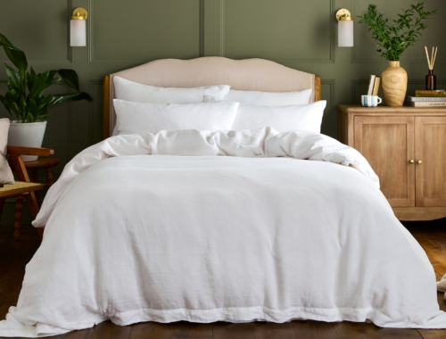
Decorating with neutral tones really is an effortlessly joyous experience and one of the most timeless decorating ideas. Far from boring, a lovingly layered neutral scheme with textural interest feels truly calming and sophisticated.
And while neutral room decor has evolved significantly in recent years—shifting from cool neutrals and bright whites to warmer, richer schemes—they remain an enduring staple among designers.
how to style neutrals
There are those of us who approach colour wholeheartedly, while others enjoy a more pared-back feel with a neutral base (and maybe some colour layered over the top).
Wherever you land, neutral is the kind of quiet hero that slots right into any scheme. The equivalent of the ‘little black dress’, here’s everything you need to know about styling the classic staple that never dates (and can be worn in so many different ways!).
building texture with neutrals
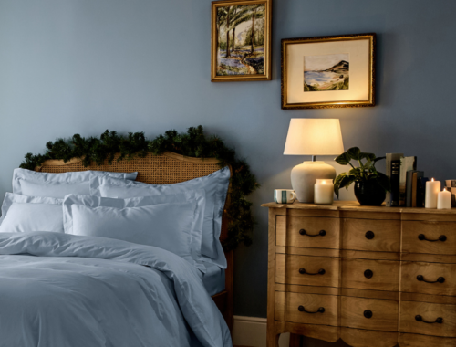
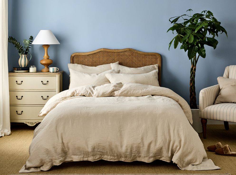
Layering interesting materials adds dimension and prevents your space from feeling flat. Natural elements like wood, stone, and of course plants, complement neutral schemes while adding organic warmth and textural contrast.
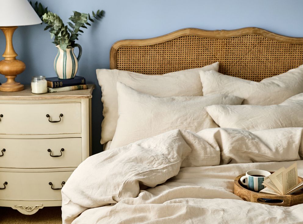
For additional character, try mixing old and new accessories, like vintage brass lamps and antique paintings paired with modern ceramics. This ensures the space feels dimensional and inviting, while maintaining its neutral palette. A kind of charm that can’t be achieved in the same way using entirely new pieces.
neutrals on neutrals
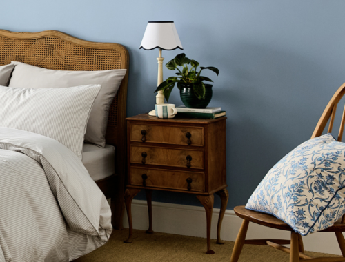
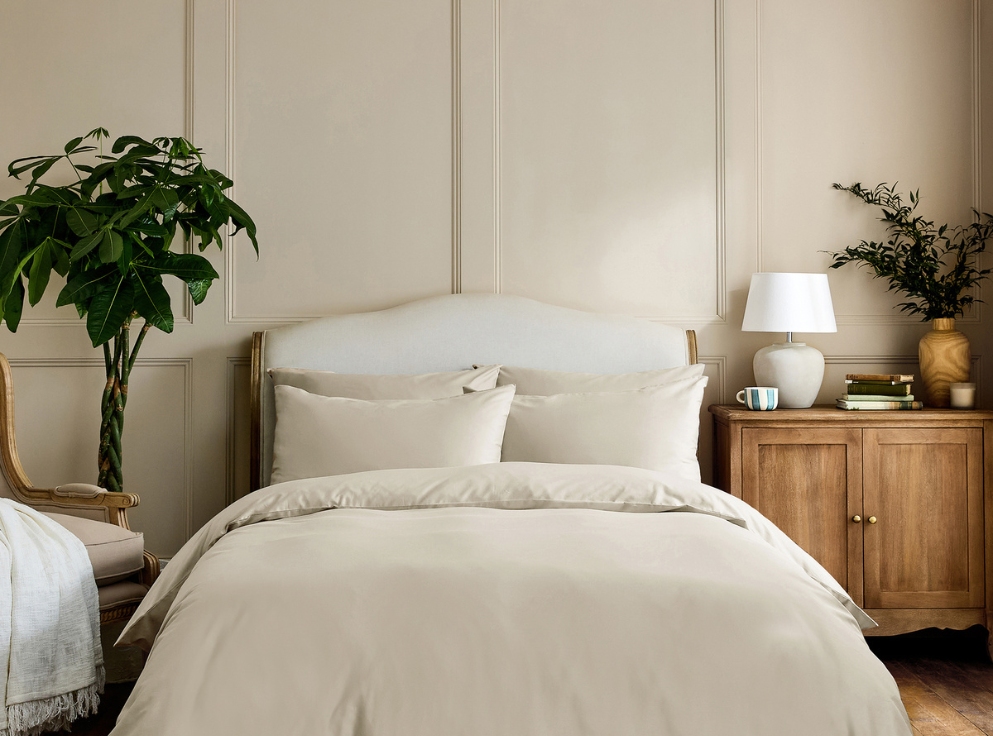
In a tonal neutral scheme, using varying shades of a neutral colour will add depth and interest. For example, set darker shades of furniture and accessories against lighter walls. This strategy makes the space feel airy, open, and full of life, but in a very natural and calming way.
But avoid mixing warm neutrals (these have an undertone of yellow) with taupe neutrals (these have an undertone of grey and purple). They’re two very distinct neutral families that are rarely comfortable together.
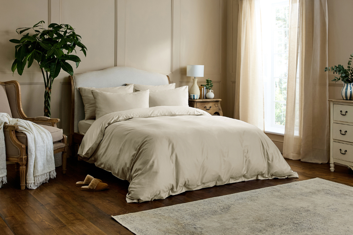
If you’re considering white walls in your neutral room, rather than using true bright whites (which can often appear stark), consider off-white and warm white paints (which feel softer and more welcoming).
pairing neutrals with colour & pattern
For those of you who enjoy layering colour and pattern, neutrals are perfect for pairing with rich, bold colours. That’s the joy of using colour on a neutral background such as your bedding or walls. You can easily add visual interest with cushions, lampshades, curtains and rugs in your favourite colours and it will definitely go together.
For instance, why not bring colour into your space with vibrant accessories and décor that add interest? This could mean considered artwork, throws, pillows, rugs, and curtains, which are perfect opportunities to introduce deep colours, rustic woods, or pastels into your bedroom.
Enjoy this timeless and versatile colour that holds its own in any season and design style.
For items used day after day, how they’re made matters. Drift off in bedding made with low-impact dyes that bring charming colours into your home, not harmful chemicals.